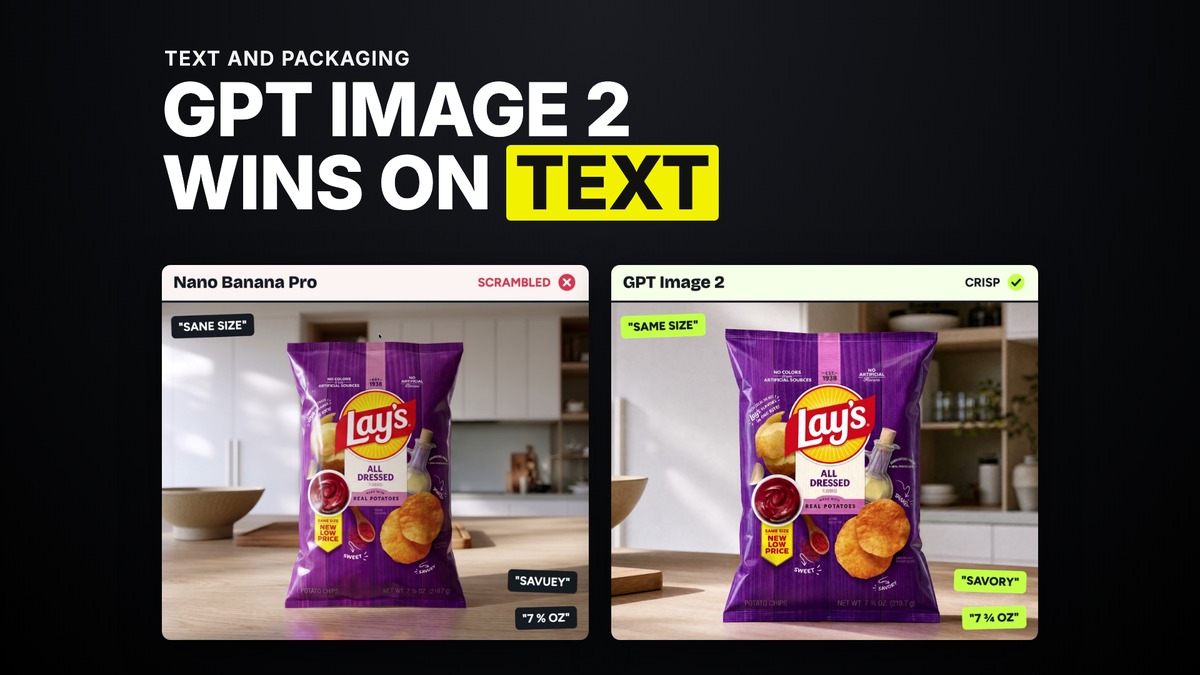
Why GPT Image 2 Wins on Text and Packaging (and Where It Falls Apart)
GPT Image 2 is the best model I use for one thing, and it is not close. Small text, packaging, labels, anything a client is actually going to read in the finished render. Put it next to Nano Banana Pro on the same product and the gap is not subtle. It is also the model most people misuse, because they open it expecting an all-round editor and it is not one.
Here is what it wins on, what it cannot do, and how to brief it so it does not come back washed out.
The chips bag test
I ran the comparison I use to settle this argument for good, a bag of chips generated side by side in Nano Banana Pro and GPT Image 2. Nano Banana Pro misspelled "Savory," and turned "same size" into "sane size." Zoom into the small print and it was gibberish, unreadable, a flavour word that just reads as noise. GPT Image 2's version held every word, at every size, the way it would actually print on packaging a client sends back for approval.
That gap is the whole reason GPT Image 2 gets the on-product text job by default now. If a client is going to zoom in and read a label, a sign, a menu board, anything smaller than a headline, generate it in GPT Image 2 first.
Why it wins on text specifically
It comes down to text fidelity and spatial understanding. GPT Image 2 has the highest ability of any model I use to recreate tiny, detailed text accurately, and it pairs that with a genuine sense of where an object belongs in physical space, which matters as much as the letters themselves. A label needs to sit correctly on a curved can. A sign needs to read as if it were actually mounted on that wall, not pasted flat. GPT Image 2 gets both right more often than anything else I test against it.
It can also read a design and extract its system rather than just its pixels. Feed it a product and it will pull out the colour palette, the typography, the materials, understanding the intent behind the design and not only what is visibly there. That is a different skill from generating a pretty picture, and it is the one that makes it useful for packaging work specifically.
Its other real strength: photoreal UGC
Text is not the only place GPT Image 2 leads. Straight from a text prompt, with no reference at all, it produces photorealistic UGC style content better than most of the field. That is the second job worth remembering it for. Faces, casual phone-shot framing, the texture of a scene that is supposed to look like a real person filmed it. Between text and UGC realism, that is the model's whole lane.
Where it falls apart
Do not edit with it. Take an image you generated, or any reference photo, and ask GPT Image 2 to change one thing in it, and the quality drops. The background goes soft, noisy, sometimes pixelated, and it compounds with every additional pass. If you need to change an angle, alter a scene, or make a second pass on something you already like, that job belongs to a different model. GPT Image 2 is a generate-from-scratch tool, not a re-touch tool.
It also struggles with cinematic shots specifically. Ask it for a graded, film-like frame and the backgrounds tend to go mushy, and the overall look loses the specific grade you asked for. If the shot needs to feel like it came off a specific camera and lens, GPT Image 2 is not the model that will deliver that on its own.
The face problem worth knowing before you build a sheet
On character sheets specifically, GPT Image 2 can over-texturise faces, pushing the skin toward too much grain and sharpness rather than a natural finish. It still gives you the highest raw likeness from a single reference of anything I use, so it stays the safer choice when consistency across many generations matters more than softness. If a face is coming out harsher than you want, that is the trade you are making, and it is worth knowing going in rather than discovering it after a client sees the render.
How to brief it so it does not come back washed out
I have seen a prompt keep coming back flat and grey no matter how many times it was regenerated. The prompt itself was the problem. It asked for lifted blacks, limited dynamic range, and haze, all in an effort to avoid a washed out look, and all three of those phrases describe a washed out look. GPT Image 2, like every image model I use, builds toward what you describe. A negative instruction, no washed out colours, no low contrast, still puts washed out and low contrast into the model's head, because it has to picture the thing before it can avoid it.
The fix is to say what you actually want, not what you do not want. Instead of "no lifted blacks, no haze," describe the grade you are after directly, deep blacks, full contrast, clean air with no haze in it. Same intent, completely different result, because now the model is building toward the picture you actually want instead of the one you were trying to steer away from.
When to reach for it, when not to
Reach for GPT Image 2 first for anything with text a client will read, for object and product sheets, and for photoreal UGC generated straight from a prompt. Reach for something else the moment you need to edit an existing image, or the shot needs a specific cinematic grade rather than a clean, literal render. Know it will sharpen skin more than you might want on a face, and brief it in positive language, describing the look you want rather than the one you are avoiding.
Common questions
Is GPT Image 2 the best model for text in images?
Yes, by a clear distance in my own testing. It holds small, detailed text accurately where other models turn it to gibberish, which makes it the default for packaging, labels, and signage.
Can I edit a photo with GPT Image 2?
You can, but every edit degrades the image, softening and adding noise to the background. Generate fresh in GPT Image 2 and do editing passes in a different model.
Why does my GPT Image 2 output look washed out even though I asked for high contrast?
Check whether your prompt describes what you do not want rather than what you do. Phrases like "no haze" or "no lifted blacks" still put haze and lifted blacks in front of the model. Describe the grade you want directly instead.
Is GPT Image 2 good for cinematic shots?
Not as its strength. Backgrounds can go mushy and the specific grade can slip. It is stronger for photoreal UGC and anything text or product focused than for a graded, film-like frame.
Want the full method and the community that runs it every week? Join GenHQ.